
How to Compare Audiences
Selecting Audiences to Compare
Start by creating your first audience. Let’s say you’re interested in comparing Yeti and Hydroflask. For this example, we will start by creating a new interest-based audience, and add “Yeti Coolers” to our query.
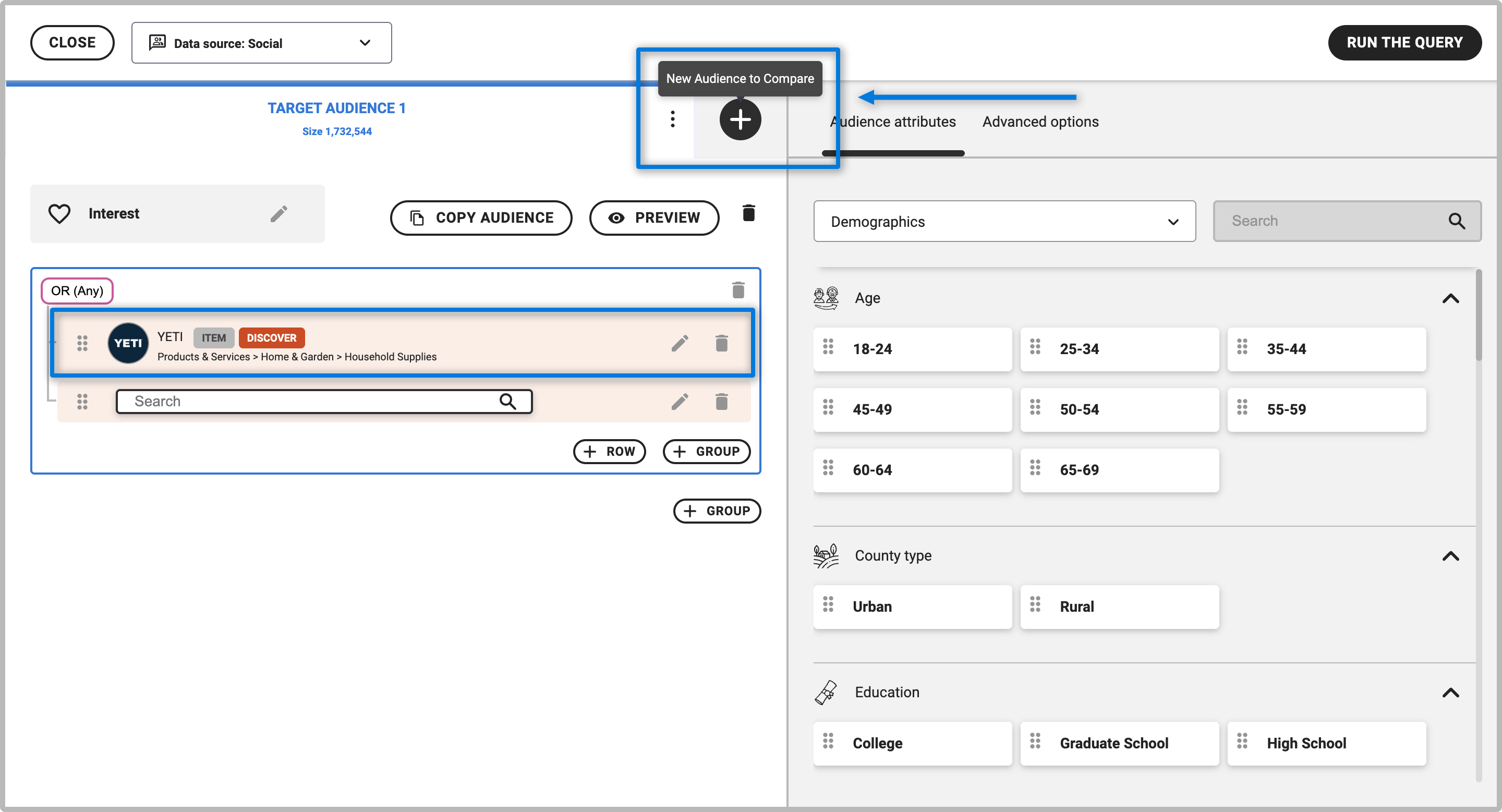
Hit the " + " button on the right-hand side to add a second audience to your search. After hitting " + ", you will see another search bar appear where you can add items to your second query.
Add items to your second query. For this example, we will be adding Hydroflask as our second query. Keep in mind that when looking at results, the order of items will primarily reflect the most relevant traits and interests for your first (top-most) audience.
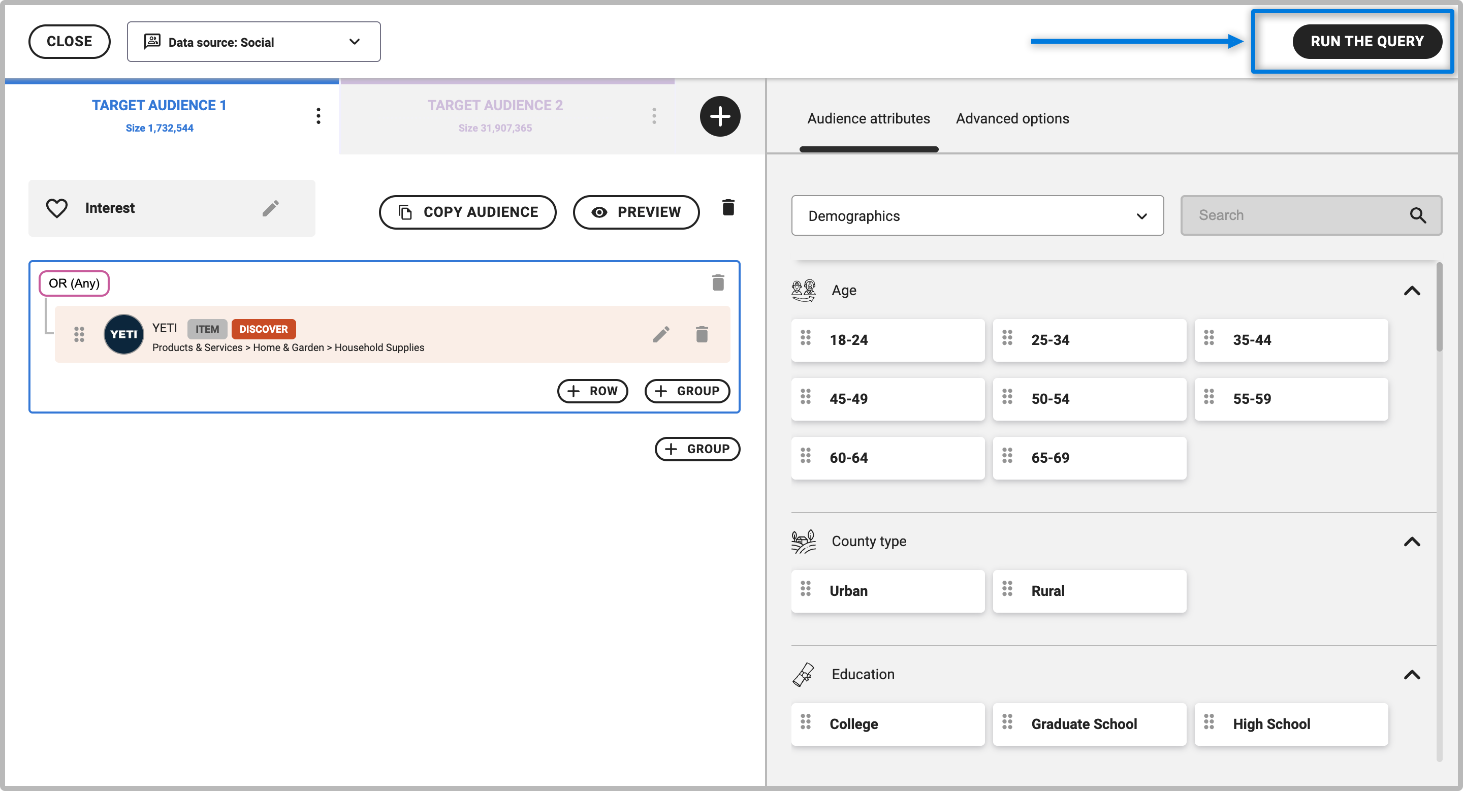
If you like, you can click on " + " again to add a third audience to your comparison search. You can toggle between the resulting side-by-side audience targets by clicking on either header. The audience target you’re modifying is shown in white, while the other target is grayed out.
Click “RUN THE QUERY” once all of your audiences have been selected.
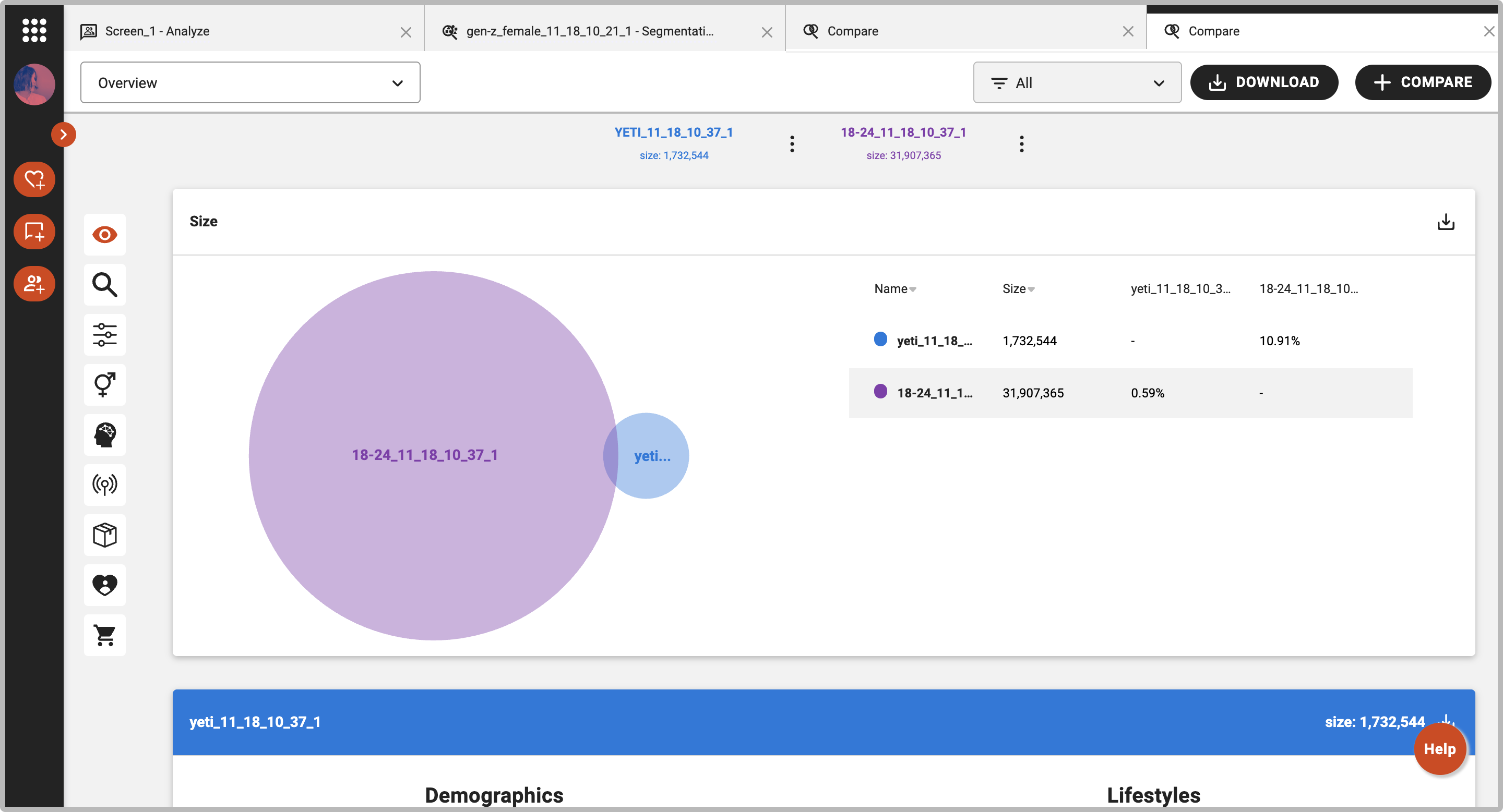
After a moment, the platform will bring you to an overview page that shows the overlap, and compares the audiences you selected.

Navigating Results - Comparison Overview
The first graphic, a Venn diagram, shows the relative size and overlap of the two audiences. As the size of Yeti’s circle indicates below, 2.83% of Yeti’s audience fall under Hydro Flask’s audience, while 13.39% of Hydro flask’s audience fall under Yeti’s audience.
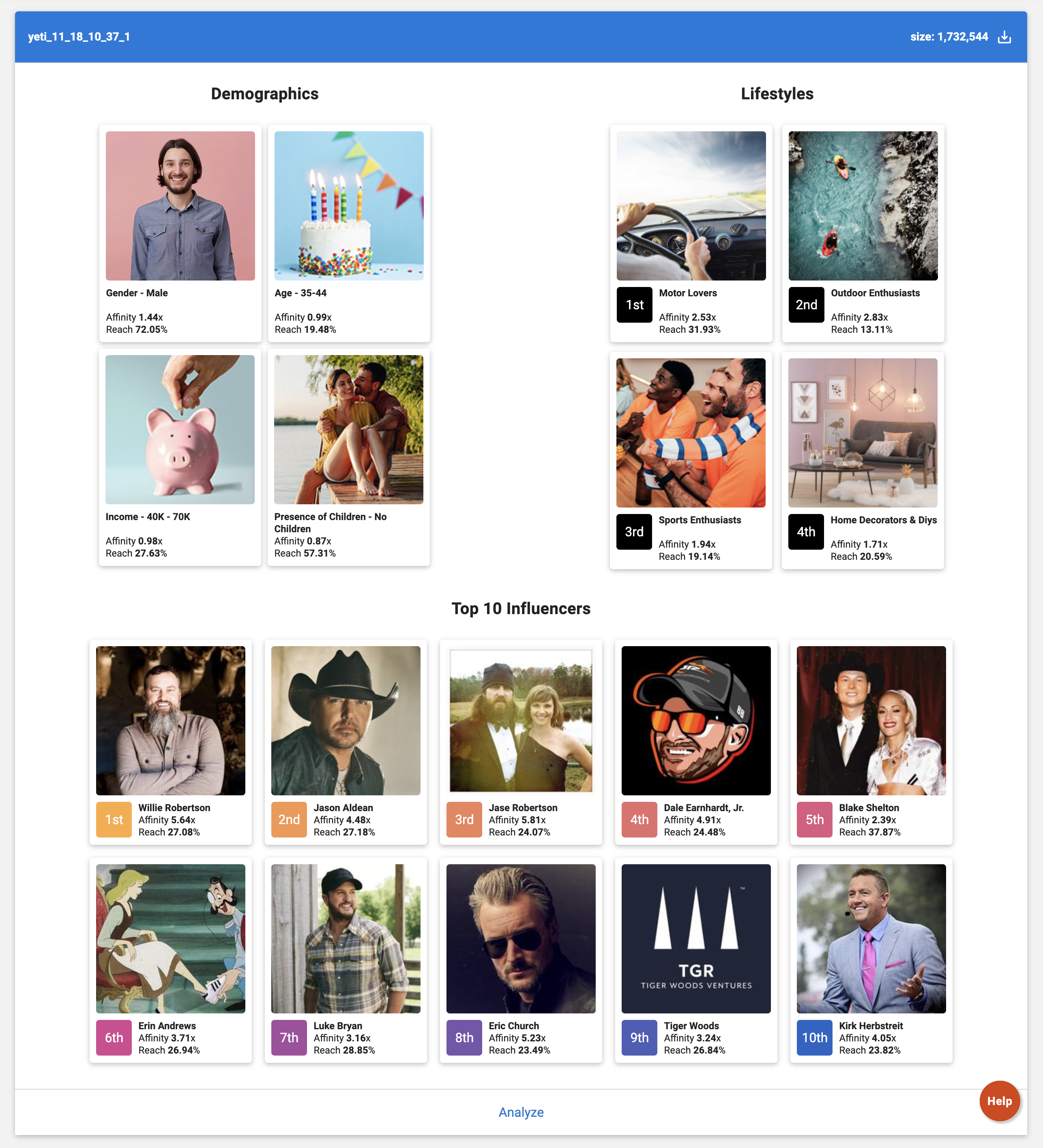
The next set of side-by-side mosaic charts quickly summarize what makes each queried audience unique. Each mosaic chart shows key demographic traits, psychographic traits and interests that are most relevant for that audience.
In the example continued below, we see that Hydro Flask’s audience has the highest reach among women and in the West, whereas Yeti has the highest reach with men and in the South. Looking at Psychographics and Interests, the differences become more clear between the two audiences, with Yeti fans more likely to be Motor Lovers and enjoy brands like Cabela’s, RealTree, and Bass Pro shops, whereas Hydro Flask fans are more likely to be Money Savers and enjoy brands like REI, Patagonia, and Whole Foods.
Digging Deeper Into the Target Comparison Data
Beyond the overview page, you can take the target comparison analysis deeper by navigating to any tabs on the left side bar, which include Discover, Custom, Demographics, Psychographics, Media, Interests, Influencers, and Consumption. From these tabs, select any topic categories you’re interested in learning more about.
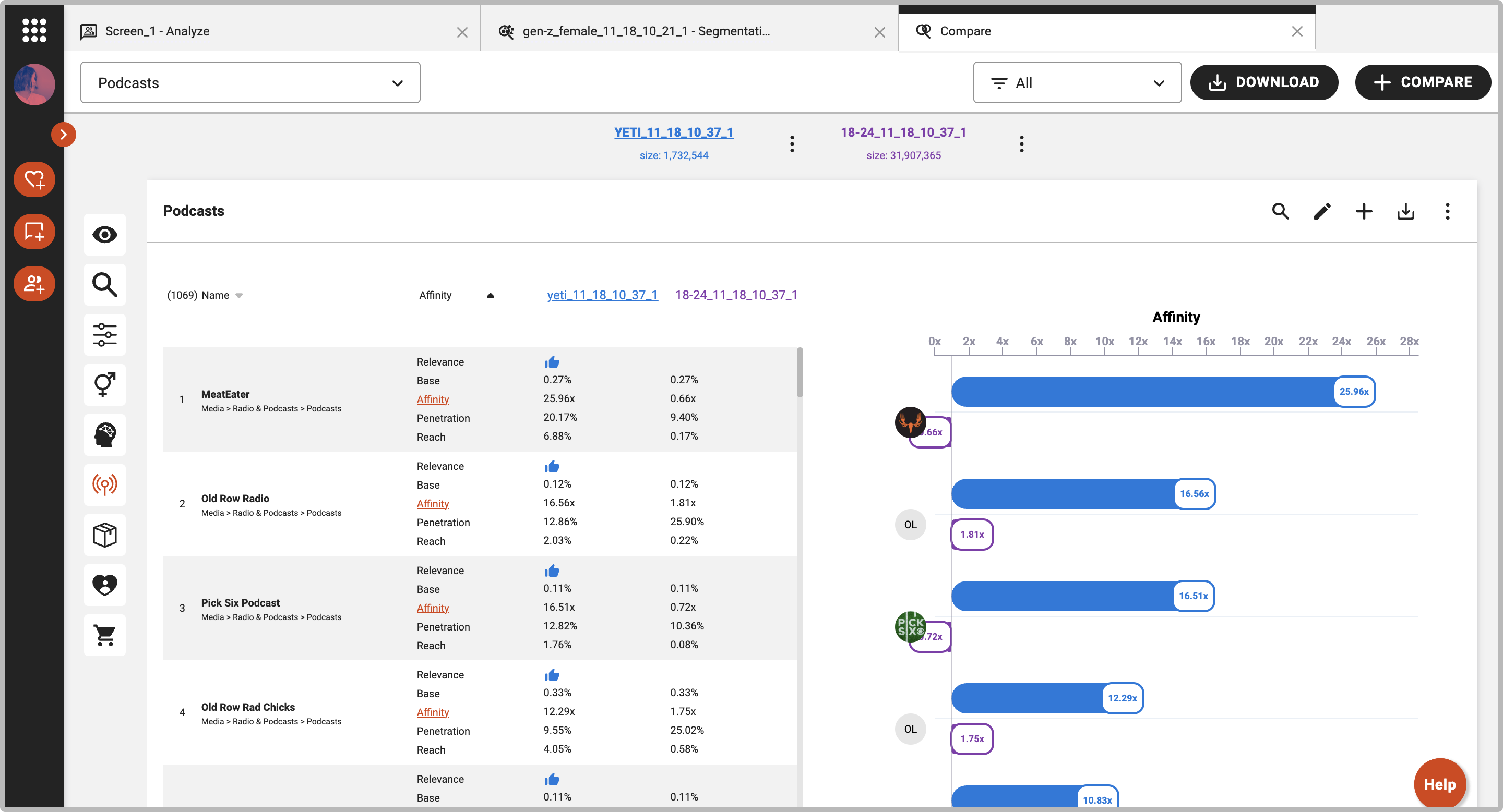
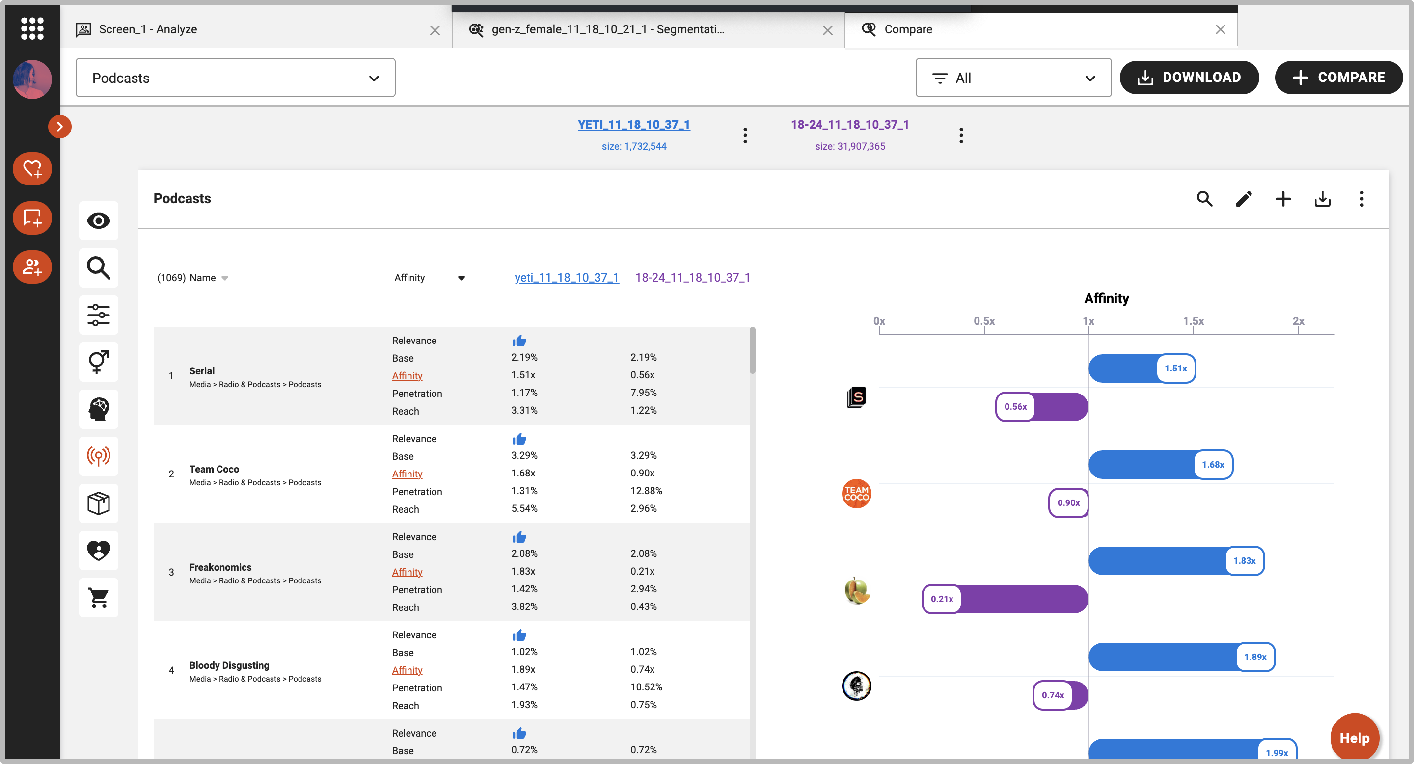
In the example below, we are displaying podcasts that have the highest relevancy for Hydro Flask. Next to each Hydro Flask audience metric, we can see the corresponding Yeti metric for that podcast.
Sorting the Multi-Target Data Within the Tables
Even when you’re comparing multiple audiences, it’s easy to sort the data within any tables and charts throughout the Discover platform. Click on the name of your target audience at the top of your screen and the data will be ordered based on that audiences’s affinity index or relevancy from high to low. To sort by a different metric or change the order, simply click on the metric you would like to sort by.
Customization/Editing Options
You can customize the look and feel of the target comparison analysis with just a few clicks.
Changing color, audience filters and more: Hover over the audience you want to edit and click on the three dots button next it to open the editing options. You can change the color, save, and preview the audience.