
Visualization
Charts
The 'Charts' tab shows visualizations of your data in different chart formats. You must have at least 1 plan with associated audience and media allocated to your plan with some metrics entered, if the plan is showing 0 for all data there will be nothing to show in the visualisation view. There are different charting modes and views available for you to visualize your data. The visualization tool allows you to turn your Plan results into a presentation ready PPT slide.
How to see a visualizations
- On the left hand of the screen click the pie chart icon on the leftbar to create to enter the visualization tool
- Select either 'Charts' tab or 'Frequency Distribution' tab to see the data visualized
- You can then use the different visualisation preferences and chart settings to change charts, see tabular data, combine or cleanse audiences, plans, media from the visualization
- Anything you create can be easily downloaded as a .pptx locally
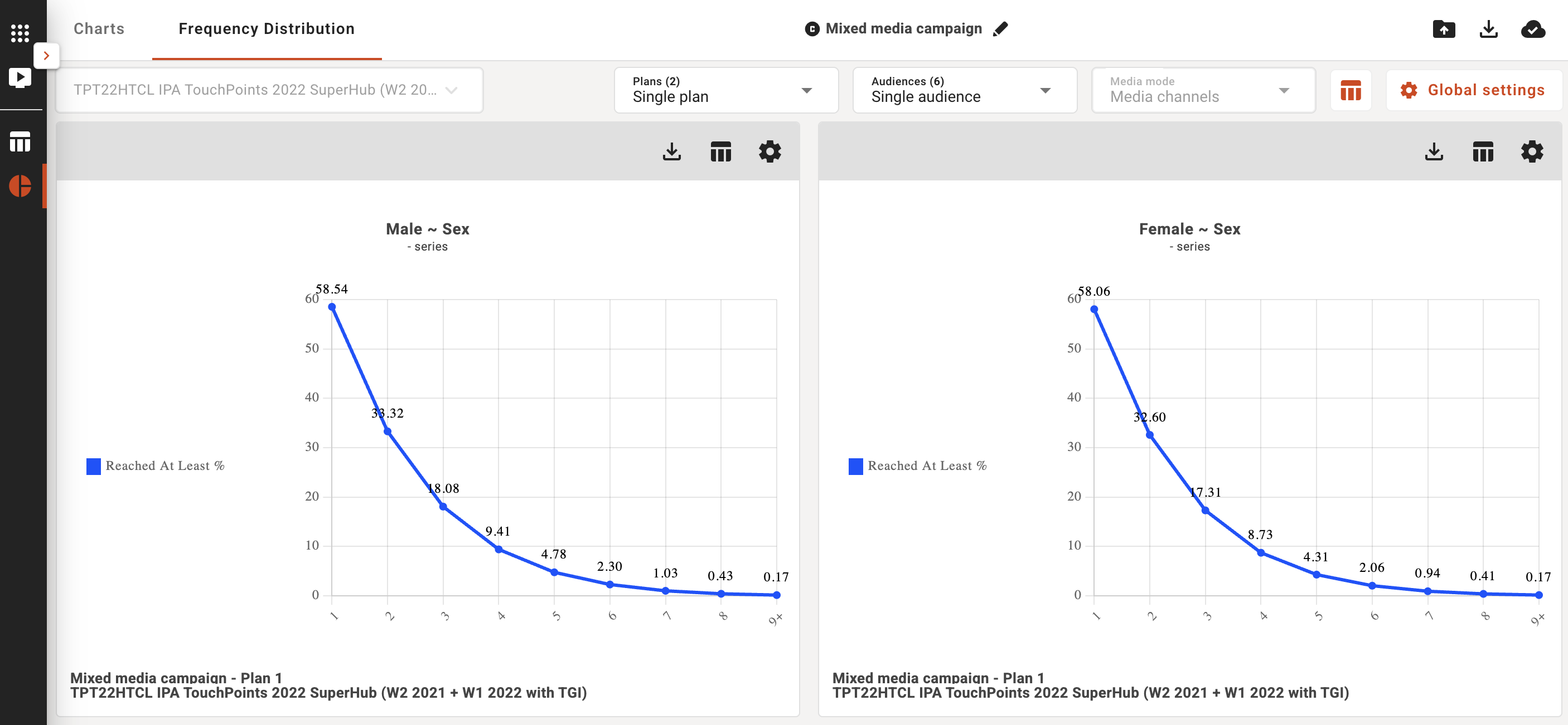
Frequency Distribution
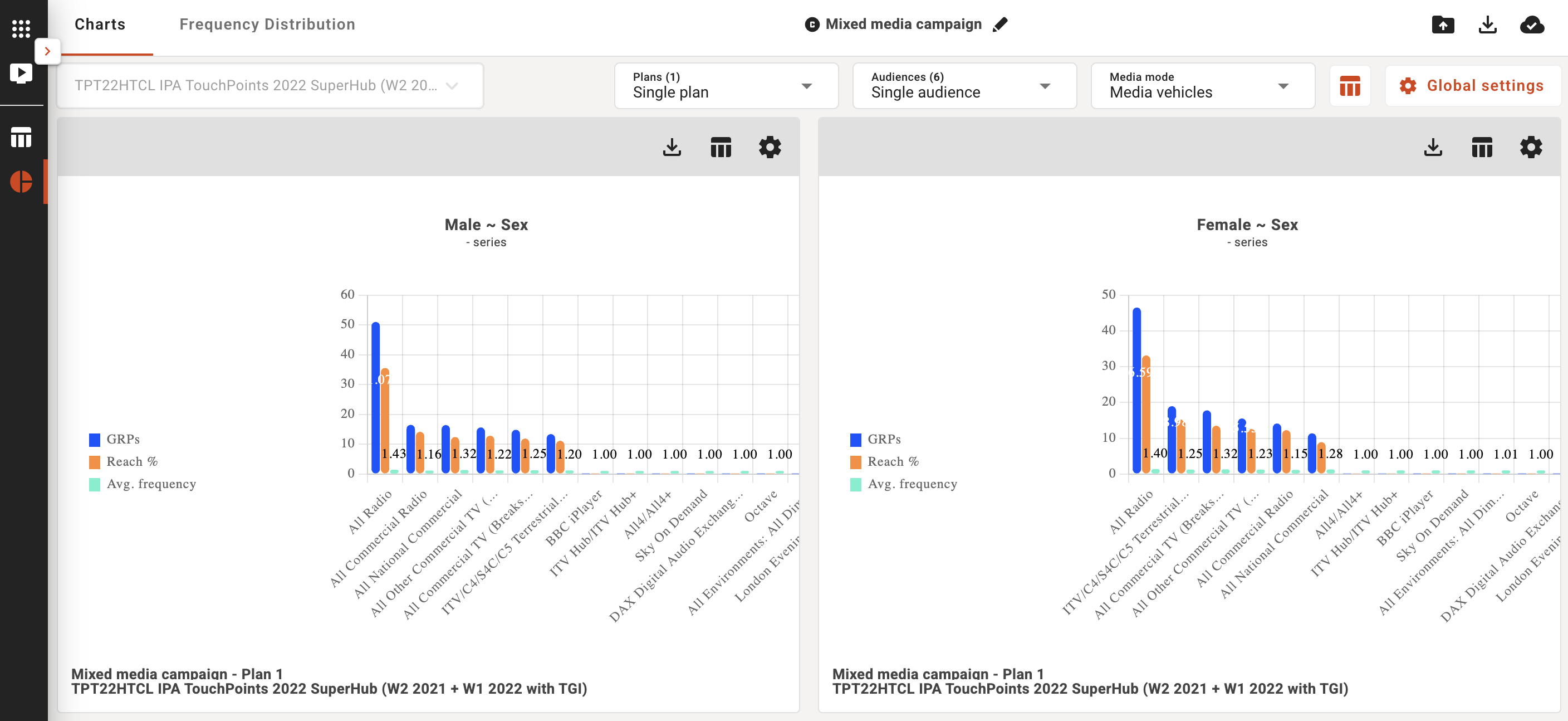
You can choose to see your plan/s visualised by audience/plan/media and see different metrics such as reach % in the standard 'Charts' view, or if you are interested in the frequency distribution you can use the 'Frequency Distribution' view to understand the distribution of reach across audiences/plans/media.
Single plan
Single plan lets you view a chart for every audience in your plan. In this mode, every chart exists in its own panel and for the individual chart panels, you can download/export a chart, apply a filter to the chart, show a data table, add a note to a chart, or open the individual chart settings.
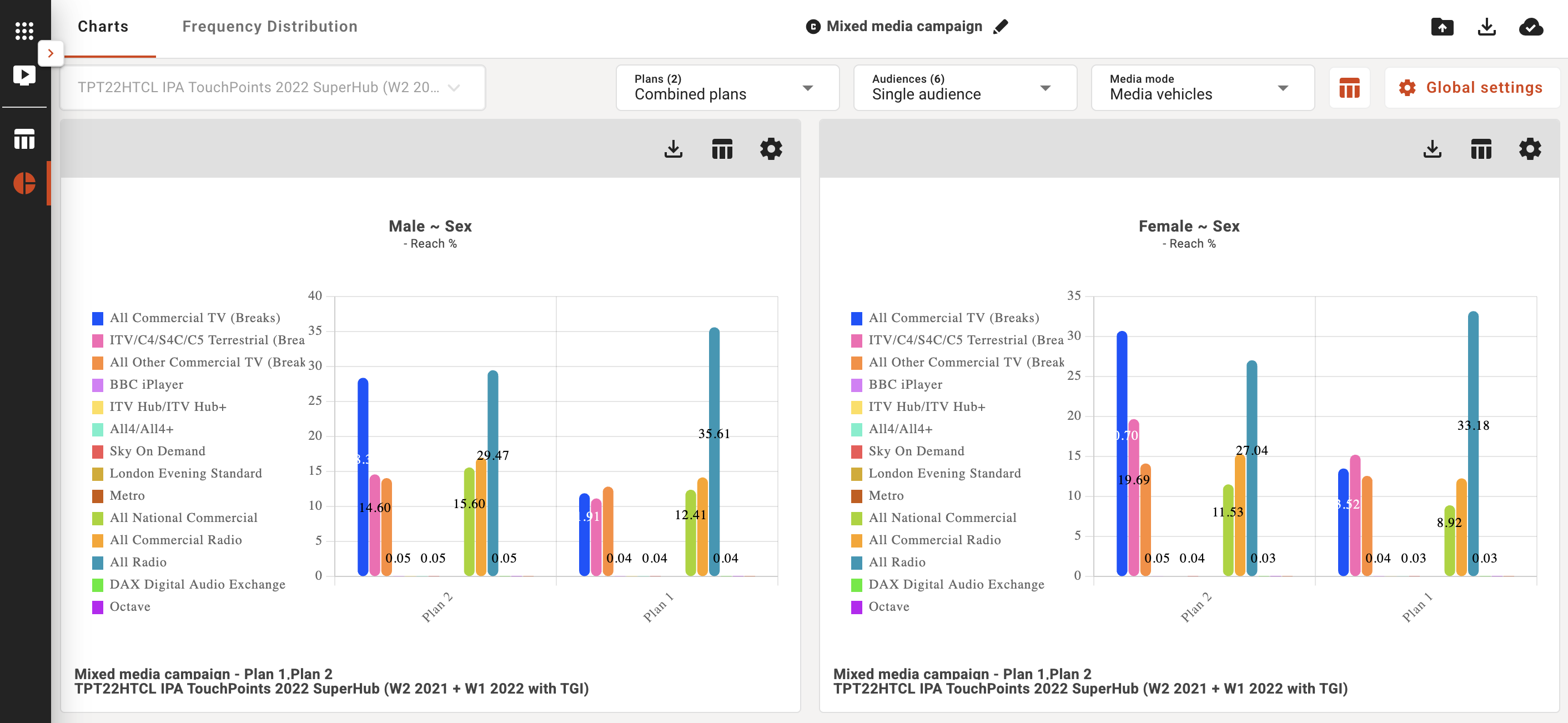
In the Default view, the target dropdown allows you choose to view a single plan, single audience, and all media by default. But you can use the dropdown controls at the top of the page to customise your chart view.
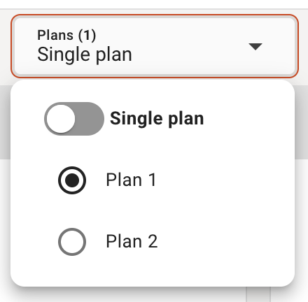
- Plans: You can see 1 plan at a time or you can see your plans together by changing the 'Single Plan' toggle to 'Combined plans' option.
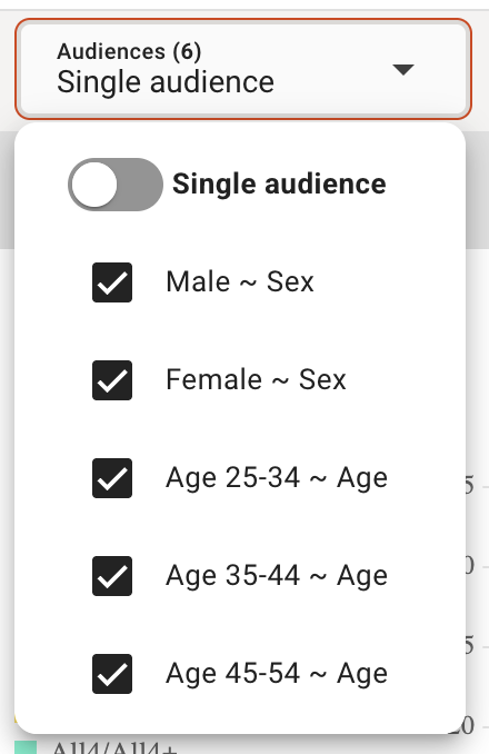
- Audiences: You can see 1 audience at a time or you can see your audiences together by changing the 'Single audience' toggle to 'Combined audience' option.
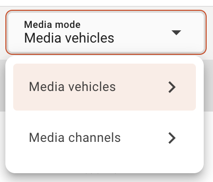
- Media mode: you can control the media vehicles you can visualise and turn them on and off with this preference control. By default the 'Media vehicles' are displayed but you can select 'Media channels' to see that view instead.
 |  |  |
In the dynamic view, you have the option to apply custom audiences, by using the custom audience dropdown, to your charts for analysis and visualizations.
Table Data
You can select the table icon at the top to show the table data view next to the graphs:
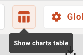
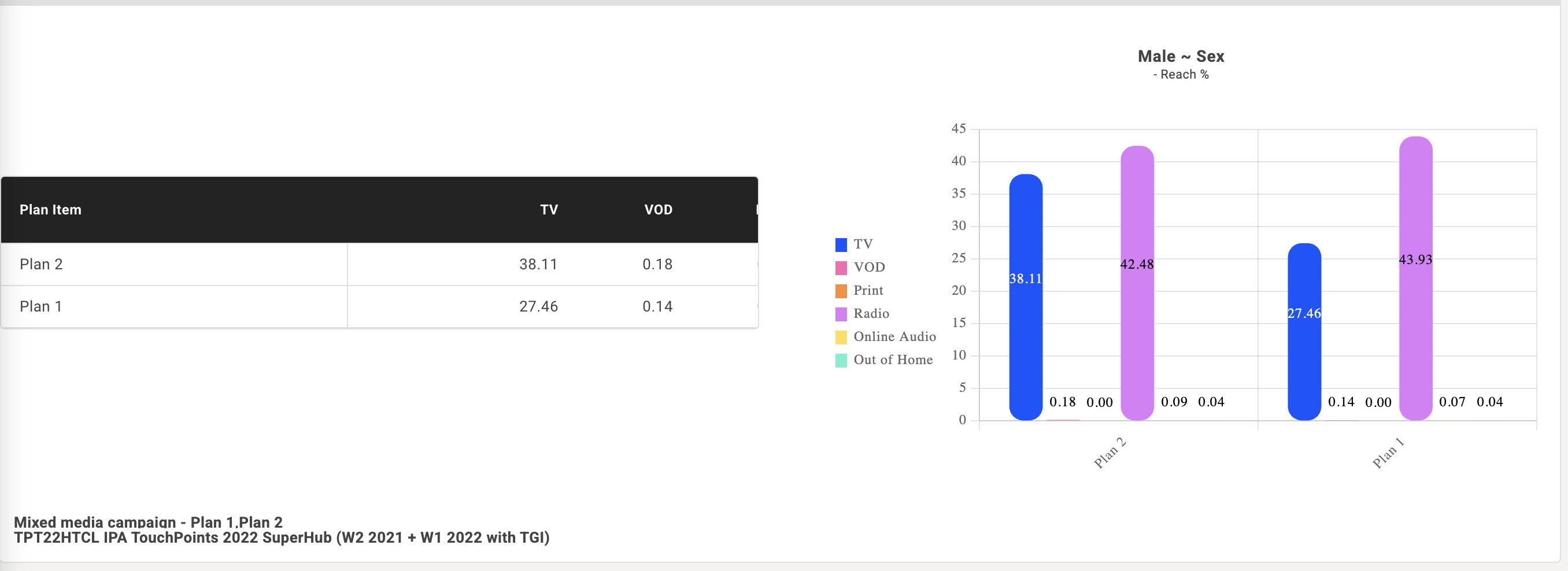
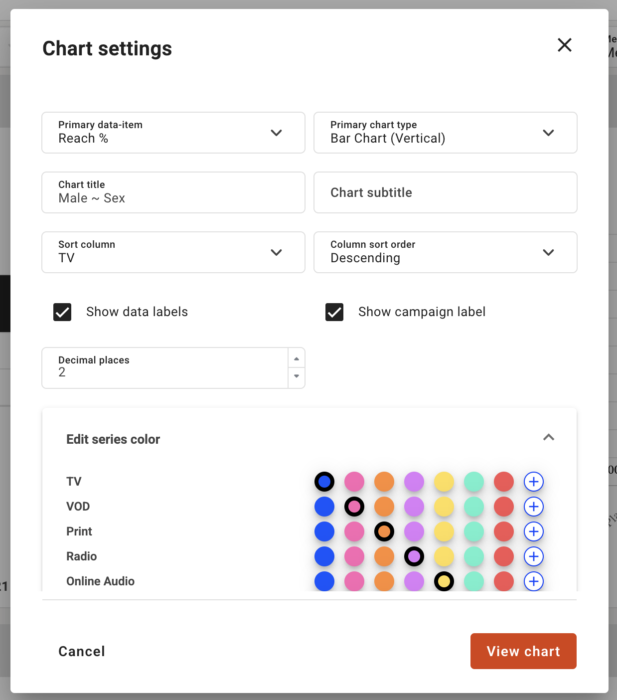
Chart settings
Both global and individual chart settings allow you to change the following:
Chart title and sub title:
Title of the charts
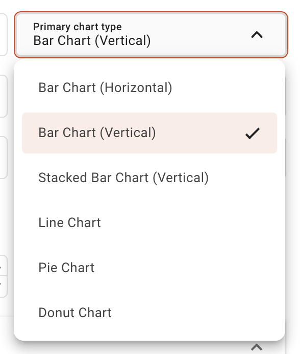
Primary data item & Primary chart type:
The primary data item showed on the chart and the type of chart used to show the data item
Sort column:
Choose the column to use to sort the data. In global chart settings, you can choose between only the primary and secondary columns.
Column sort order:
The order of which to sort the columns
Show data labels checkbox:
Control to turn on or off this graph visual aid.
Show campaign label checkbox:
Control to turn on or off this graph visual aid.
Decimal Places:
Number or decimals you want to specify in the visualisations
Edit color series:
You can specify colour or add your preferred brand hex reference colour to brand your charts and graphs
Note: Global chart settings will apply to all the charts in the visalizations section.
Downloads
All charts and graphs can be downloaded via the download icon and this will send the chart or graph to pptx format downloaded locally to your desktop.
